Een artikel over hoe Bonnard kleuren gebruikt en hoe wij naar kunst kijken. Meneer Pepperell schrijft hoe ik zelf kijk (naar kunstwerken maar ook naar de werkelijkheid om me heen) en dit artikel maakt me blij omdat ik graag zo nadenk over dingen.
Dat je meer ziet dan dat je eerst zag.
Hoofdpunten zijn dat Bonnard niet alles scherp schildert. Een blob kan een vaas zijn of een tas of een kat.
Dat is een bewuste keuze, om dat niet te doen. Waarom? Welk doel?
Het tweede is dat hij vaak tegengestelde kleuren bij elkaar gebruikt. Warm geel tegen koel paars. Maar veel subtieler dan je gewend bent van Van Gogh of je kleurentheorie.
Ten derde dat hij die tegenstellingen zonder contrast doet, allemaal in dezelfde grijstint. Weirrrrd. En: een bewuste keuze. Compositietheorie gaat over het sturen van het oog. Het oog trekt altijd naar gezichten, menselijke vormen, plekken met groot zwart/wit contrast. Bonnard doet rare dingen en je oog blijft op safari door zijn schilderij. Gecombineerd met de niet-gedefinieerde blobs van punt 1 houdt hij je nogal bezig (als je wilt).
Het laatste punt gaat over dat je het ene ziet (een mens, een plant) terwijl je naar iets anders kijkt (verf op een doek). Daar heb ik niet zoveel mee, dat is de gezamelijke afspraak tussen een maker en een kijker en geldt bij druk en film en geschreven taal.
Dit artikel valt onder de Creative Commons en mocht daarom zonder meer hier gekopieerd worden. Dat is ook gaaf, dat Pepperell en de site The Conversation dat toestaat en aanmoedigd.
Pierre Bonnard at the Tate: the surprising reasons we love art
Robert Pepperell, Cardiff Metropolitan University
“Why do people love Pierre Bonnard so much?” asks The Guardian’s art critic Adrian Searle in his review of the painter’s current show at London’s Tate Modern. There are obvious reasons: his rich colour, his warm light, his human intimacy.
But I suggest we love Bonnard less for his harmoniousness (which Searle often finds too lovely) than his unsettling pictorial dissonance. Surprisingly, it is what is perceptually unpleasant or jarring about Bonnard’s work that powers his painting.
I am an artist who uses science and philosophy to understand how art affects us. My work has led me to think that art is most exciting when it creates states of psychological conflict, confusion or dissonance. Here’s three ways we can see this in Bonnard’s work.
What is it?
The first conflict inflicted by Bonnard on our senses comes from his use of what I call “visual indeterminacy”. Visual indeterminacy occurs when we are presented with something that defies immediate recognition. We have all experienced this when, for example, seeing a vague shape in the corner of a room that might be a cat or a bag. Further inquiry is often needed to satisfy our curiosity.
Bonnard’s paintings are full of such moments, evoked by passages of paint that suggest one thing, turn out to be another, or resist classification altogether. If we look at Still Life with Bouquet of Flowers (below) the book, vase and table are all pretty readable. But what is in the space behind? Perhaps a chair back or a door, some textiles, a human figure on the far right. It’s hard to be sure.
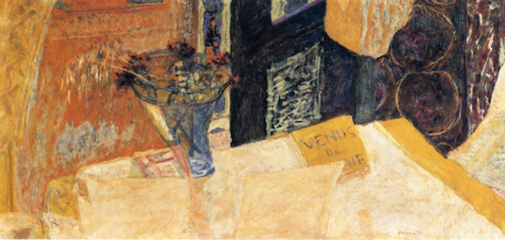
Image courtesy of Tate Modern
Visual indeterminacy trades on the expectation that pictures contain recognisable objects. When this expectation is thwarted we undergo a degree of cognitive dissonance that may be frustrating, or even unpleasant. But an indeterminate artwork need not be any less powerful for that.
I collaborated with a neuroscientist, Alumit Ishai, to study the effect of indeterminate artworks on the brain. We compared indeterminate paintings of mine to paintings that were visually similar but contained recognisable objects. We found the longer people spent looking at a painting, trying to determine what it depicted, the more powerful they rated it as being. It seems aesthetic power is somehow bound up with perceptual ambiguity.
Colour conflicts
The second way Bonnard evokes dissonance is through his use of colour. Complementary colours lie opposite one another on the spectrum. Red, for example, complements blue while yellow complements violet. Because of the way light is processed by the eyes and brain, complementary colours – when placed in close proximity – are apt to jar the eyes as in the abstract painting below.
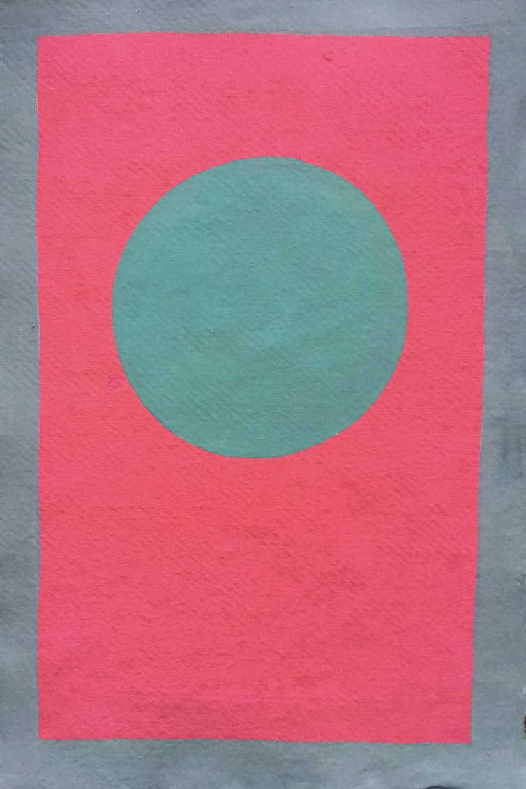
Robert Pepperell, 2019
Bonnard frequently exploits this effect in subtle and complex ways. In Nude in the Bath of 1936-8, we see streaks of blue-grey jostling with burnt sienna pinks in the bather’s skin, and a large patch of violet neighbouring a deep yellow in the upper right. In many of Bonnard’s paintings the clashes of complementary colour, along with the noisily textured paint, animate the surface and make our eyes dance to a discordant tune.
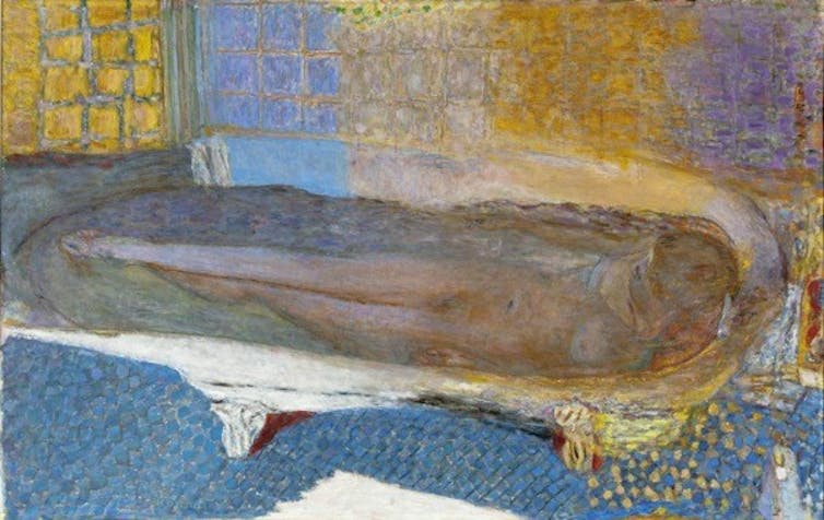
Image courtsey of Tate Modern
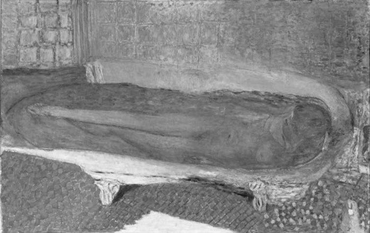
Bonnard also exploits another optical phenomenon, which scientists call equiluminance. If we convert the abstract painting to monochrome, as below, the vivid vibratory effect disappears, but so does everything.

Robert Pepperell, 2019
While the circle and in its background are violently different in the coloured version, the level of light coming from each area is equal. This confuses the parts of the brain that process colour and luminance.
Robert Pepperell from Pierre Bonnard original
If we now look at the bathing painting in monochrome, we see that Bonnard also used equiluminant hues. In this version the skin looks much flatter and the yellow-violet clash is reduced to a grey uniformity. Bonnard is throwing our senses of colour and light into conflict.
A logical impossibility
A third way Bonnard piques our senses is actually a feature of all representational art, although Bonnard exploits it with exceptional skill. Figurative paintings contain a logical impossibility: we see one thing (the painting) which is simultaneously another thing (what it depicts).
Looking at Nude in the Bath we see a woman lying in a tub of water and a sheet of canvas dabbed with paint. We keep these two realities both separate and unified in our minds, despite the paradox this implies.
In a recent paper I investigated this tension between the material and representational layers in artworks. I showed how dichotomies, tensions or contradictions contribute to the excitement and puzzlement we can experience with art.
For example, Bonnard, like many modernist painters, tends to highlight the “material-ness” of the paint by the way he applies it – in textured globs. In the Still Life with Bouquet this contributes to the fog of indeterminacy. In the Nude in the Bath we can read the yellow dabs on the floor to the right as both petals of paint and as sparkles of sunlight.
Meanwhile, Waldemar Januszczak, in his review of the show, berates Bonnard for his clumsy and awkward outlining of objects and anatomy (incidentally, he also disapproves of his visual indeterminacy). But Bonnard was anything but inept as a draughtsman. His deliberate gaucheness heightens the dissonance between the forms we are supposed to be seeing and those we actually see.
It might seem surprising that dissonance could be a source of aesthetic power, given we often associate art with beauty and pleasantness. But Bonnard’s paintings, at their best, induce a rare state of mind: we are at once perceptually confused, our senses are assailed and we are cognitively conflicted. While in other circumstances such an onslaught might make us run a mile, with art we are held transfixed.![]()
Robert Pepperell, Professor, Cardiff Metropolitan University
This article is republished from The Conversation under a Creative Commons license. Read the original article.


